Oct 28, 2025
Doing, reading, failing
Curiousity got me to use Cursor, Unicorn Studio, Perplexity and get 118k impressions online
Harsha GowdaAssociate UX Designer at Woods Creative
Doing + Reading + Failing (early) >>> Anything”
That’s what my senior, Zaid Parkar, told me when I asked how he managed to vibe-code a working prototype for his MS HCI capstone project. I was expecting a neat step-by-step process, but instead he said:
“Bro, there is no thinking tbh. Just wanted to do it. Spent days and nights figuring it out and doing it. I had pneumonia, was bored in bed, so I tried Cursor.”
That mindset stuck with me. Sometimes not knowing the “correct” process is exactly what pushes you to experiment and learn faster. Be curious, my friend.
And that curiosity is what led me to my own little experiment, one that unexpectedly caught attention online.
Context
This blog is a peek behind the scenes of building girlfriend-guide.netlify.app, a small, fun side project that unexpectedly blew up online, pulling in 118k impressions on LinkedIn.
Girlfriend Guide started as a lighthearted idea: a collection of tips from a friend who was always sharing advice on how to be a better boyfriend. I figured if those tips helped me, why not share them with my fellow soldiers out there?
The build itself became an experiment in mixing tools: Unicorn Studio, Cursor, ChatGPT, Perplexity, and a few others. What began as a personal inside joke turned into a polished little project that the internet seemed to enjoy.
And here’s how it all came together…
How were the illustrations created?
It was actually inspired by Palito's illustrations. I really liked the hand-drawn doodles. I wanted to bring that same vibe into my project. I am not an illustrator or know how to draw, so I turned to ChatGPT.

The first prompt I used to generate the illustrations actually worked surprisingly well. You can peek at the original first chat here.

Was it 100% perfect? Nope. Were the characters consistent across iterations? Not really. But for a side project, it was “good enough,” and I was honestly just happy it worked on the first take.
The more I iterated, the more ChatGPT lost track of the character consistency — which is a well-known quirk. I could’ve kept refining the prompts with extra context, but I’ll admit: I was a little lazy.
Once I had a set of illustrations, I stripped out the backgrounds and converted them from PNG → SVG, so that I will have the freedom to change the colors accordingly. After testing a bunch of tools, pngtosvgconvert.com turned out to be the most reliable.
At first, these illustrations looked fine in my card-like version. But when I shifted the concept into a personal diary layout, the vibe fell apart. Suddenly the polished outlines looked unfinished — more like clipart than sketches.
So I started digging. After a lot of rabbit holes, I found game-changing tools:
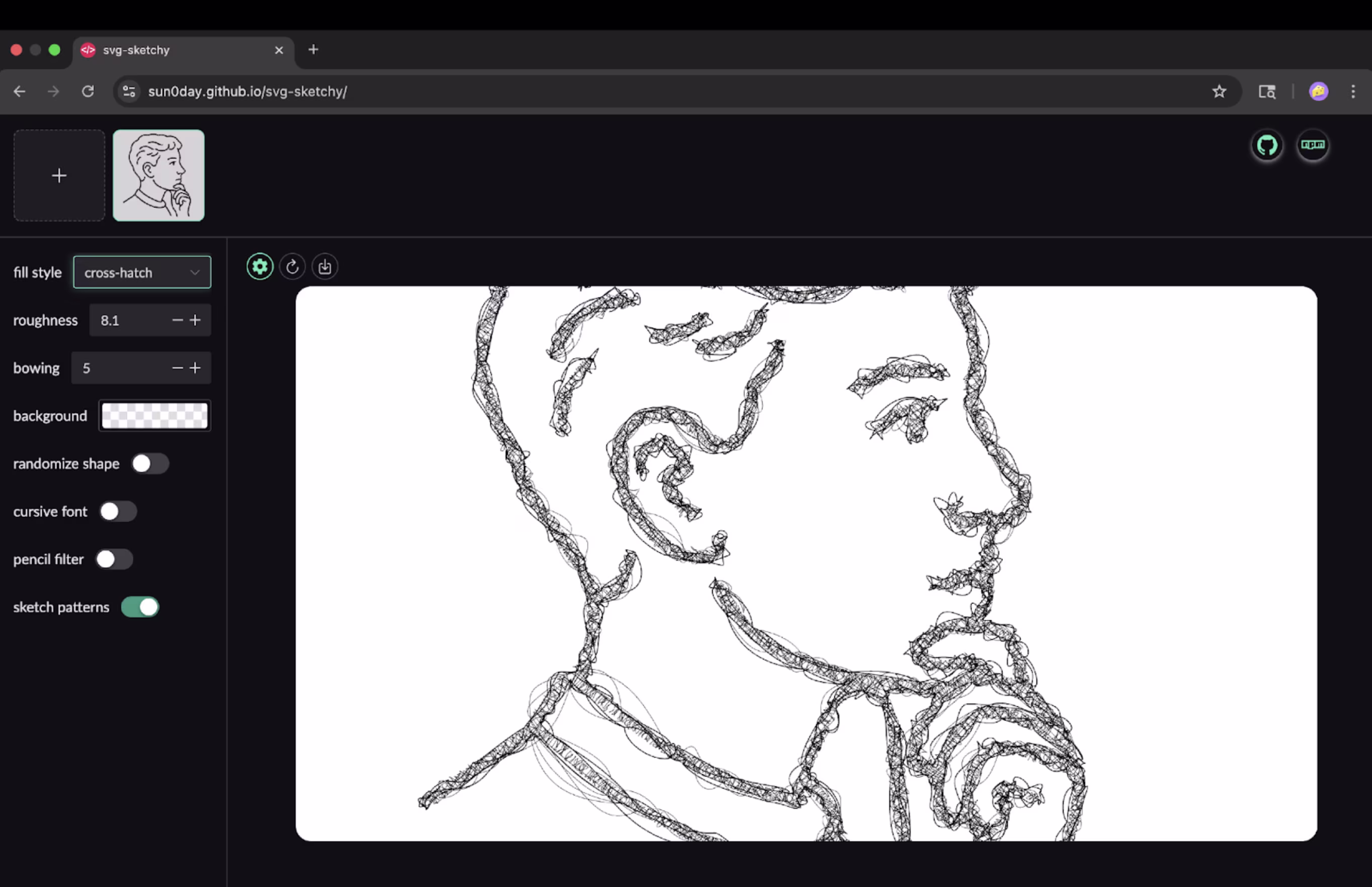
They helped me transform my clean SVGs into pen-sketched illustrations — the kind that look like they were scribbled with a ballpoint pen on paper. That subtle imperfection gave the illustrations the handmade warmth I was after.
How AI models helped me in copywriting
When it came to writing the copy, I quickly realized there’s no single magic prompt that spits out “the perfect guide.” Copywriting feels different from illustration — it leans heavily on taste, experience, and iteration.
What I wanted: a guide-like tone with a dash of humor.
What I did: talked to multiple models, compared results, and stitched together the best bits.
Out of 25 variations, I’d maybe like… one. And that’s the point: copywriting with AI isn’t “ask once, done.” It’s more like sparring until you find the right rhythm.
Perplexity often gave me the best results for copywriting. Yes, Perplexity doesn’t have its own standalone model — it routes queries through third-party ones.
I felt like it matched context with the “right” model for the job. Not always, but often enough to notice. It wasn’t perfect, but when it clicked, the tone felt sharper, more grounded.
I would say…
Keep the variations sample small. Don’t ask for 50 variations , it only makes the model ramble or hallucinate. Get a few options, and restart the chat if the context gets too long.
Train your taste. Read people online who write honestly and from the heart (not only copywriters or influencers). Notice why their words work, stay curious, and let that shape how you edit AI outputs.
I don’t think there’s a website where AI just hands you a perfect copy on the first try. And honestly, that’s fine. The fun is in shaping it, iterating, and letting your own voice cut through.
If you’ve found different hacks for making AI copy less “AI-ish,” I’d love to hear them.
Coding with cursor
For the book turning effect I used Turnjs. Turnjs is a 12 year old JavaScript library created by Emmanuel Garcia that enables users to create interactive flipbook effects, making web content look and behave like a real book or magazine. It is an open source project, originally released under a BSD license, and you can freely use, fork, and contribute to its codebase for noncommercial purposes.
The book effect came together by using the Steve Jobs example on turnjs.com as a reference. I dove into the code to understand how it worked, and understood why it worked the way it worked. With a CS background, I could make sense of the HTML, CSS,& JS and I relied on Cursor to handle repetitive tasks, adding pages, centering divs, inserting content, and automating anything that followed a consistent layout, font, or color scheme.
This was only my second vibecoding project, so honestly, I don’t even remember exactly how I got started or which prompts I used. There wasn’t a strict process—I bounced between YouTube tutorials, articles, and the Turn.js code itself to figure things out. I plan to document the full approach in upcoming experiments.
For now, know this: I had to scrap and redo the whole thing a few times before it finally clicked. Failing early and learning from mistakes is the key.
Looking back, there are a few practices I wish I had done from the start:
- Choose the model wisely
Different tasks benefit from different models. For complex tasks, I’d recommend Sonnet 4 or ChatGPT O3—they can break big problems into checklists and solve them step by step.
- Debug systematically
When your result looks good but has small errors, write them down and tackle them one by one. If you ask the model to fix multiple unrelated issues at once, it often gets confused—wasting time and tokens.
- Provide context in Cursor
Cursor works best when it understands your environment. Attach documentation links for any frameworks you’re using (see guide) and copy the problematic code into context while debugging. This keeps the AI focused on specific part of the code and saves precious context space.
- Keep your project organized
Clean folders and code structure go a long way. fonts in /fonts, svgs in /svgs, etc. This makes it easier for Cursor to find the right assets or content without guesswork.
- Collaborate while building
Pair up with a developer friend. Explain what you’re trying to build, get feedback on standards, conventions, and developer lingo. Collaboration keeps you from getting stuck and helps Cursor understand your prompts better.
- Don’t fall into the influencer trap
Those slick demos you see online “one prompt, full website” are meant to hype the tool, not show the messy reality. Real-world building takes iteration, debugging, and persistence. Expecting one-shot perfection only sets you up for frustration.
Takeaway: Doing + reading + failing early >>> anything. Start, fail, learn, and automate, don’t wait for the perfect process.
The idea of a TicTacToe game at the end.
After transferring all the guide’s content into the book, I left a few pages blank, thinking I might add more content later. Later, I felt there should be some easter eggs in the website, so that users can interact with it.
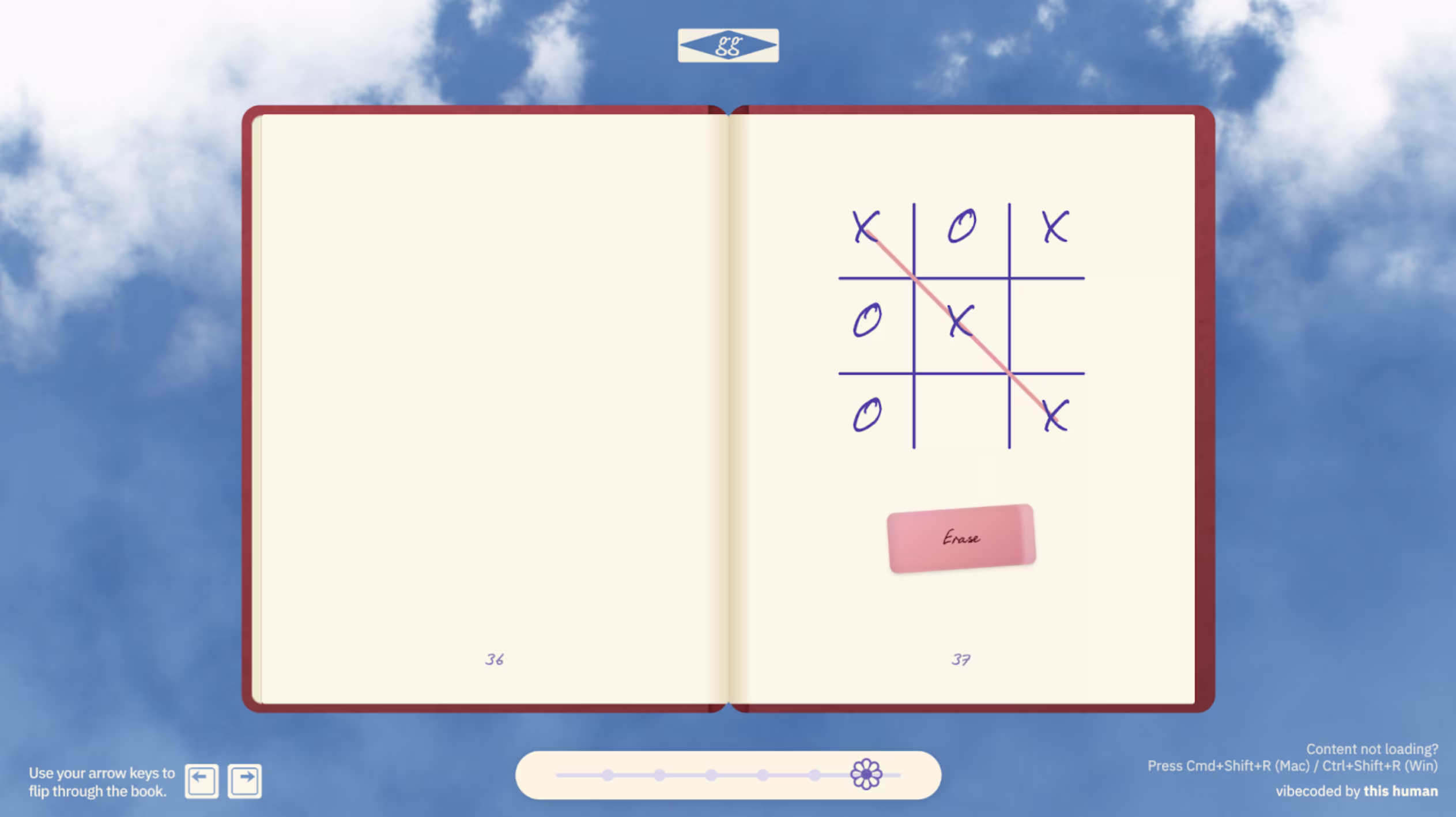
While flipping through my moodboard, I remembered playing XO (TicTacToe) back in school. I thought: why not recreate that nostalgic feeling inside the book? I explained to ChatGPT how the game should work, how the gameplay should feel, and what interactions to include. It gave me a prompt, which I then fed into Cursor. The original version had too much detail, so I removed the unnecessary parts and kept it simple.
I also wanted a reset button to clear the grid,but having a button sitting over a book page didn’t make sense. While looking around, I saw an eraser and realized it could act as the reset, and thought: why not make the reset function look like the classic school eraser? Using Cursor, I uploaded a reference image and manually edited the shadows to give it a realistic, tangible look, bringing that old-school charm back to life.
Resources to get started with cursor
Here are some beginner-friendly resources that helped me understand how Cursor works:
- Cursor Vibe Coding Tutorial - For COMPLETE Beginners
- How I Coded a Better Linktree For FREE with Cursor AI
People I follow who consistently produce genuine vibecoding content:
Also, keep an eye on aiverse.design for some amazing content that’s still under wraps.
How did I create the Sky Background with Unicorn Studio
Unicorn Studio is a no-code WebGL design tool that lets you craft interactive, motion-heavy web experiences without touching code, all built with a designer-friendly interface. It uses a layer-based system, has a wide library of effects, and projects can be easily embedded into websites.

For my project, I built the sky background entirely in Unicorn Studio. Below are the effects I combined to get the output I wanted:

👉 Remix my file here if you’d like to peek under the hood or experiment with your own twist.
Unicorn Studio is still pretty new and the community around it is small, but I can see huge potential for it over time. The possibilities for interactive design are endless once more people start building with it.
also fun fact: The only reason I added a slider in the guide’s website was to hide the “Made with Unicorn Studio” banner as I was on a free plan. Desperate times, desperate measures. 😅
How I created the design Assets in Figma
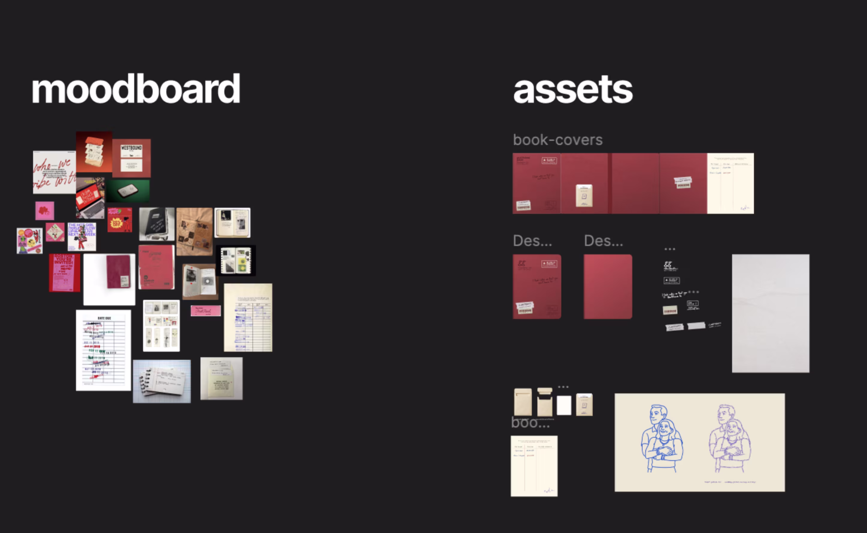
No surprises here, Figma remains my go-to. Everyone knows how to use it at this point, so I won’t waste time with basic tips. Instead, I’ll just share the community file I created so you can dig into the layering, see how I structured assets, and explore how I made them look more realistic.
👉 View my Figma community file
Closing thoughts.
TBH, I’m happy with the output, but I’m not completely happy with how I vibe-coded this project. And that’s fine. This one goes into the “learning” bucket, and I’ll build better things ahead.
Keep creating the things you love. Be obsessed with building. Collaborate with people from other disciplines: coders, writers, artists, etc , because every perspective adds a new way of thinking. And most importantly, bring your own story, your own yourness , into what you make. At the end of the day, that’s what connects human to human.
Be humble. Be kind. And keep creating amazing stuff.
Signing off,
Harsha Gowda Ramamurthy
Harsha is a product designer focused on visual design and user research. He is pursuing his master’s in Human–Computer Interaction at Indiana University, Indianapolis, and sees design as a dialogue between empathy, process, and possibility.
RELATED INSIGHTS
I spent the afternoon with AI design leaders
An eye-opening experience into the future of design work.

The death of the search bar (as we know it)
A new UX pattern that's quietly evolving every app you use.

A new aesthetic is emerging
Software landscapes: adding emotional context to your product marketing.


Updated weekly with new examples
200+ curated AI interactions
From ChatGPT to Figma AI, explore the best AI UX patterns from leading products.
Join 14,000+ design and product folks